How to Design Custom Packaging That Sells: 7 Expert Tips
Great packaging design isn't about adding more: more colors, more copy, more finishes. It's about making deliberate choices that support how a customer feels in the moments before, during, and after they open your box. After manufacturing custom packaging for hundreds of brands across cosmetics, food, ecommerce, and retail, we've noticed the same handful of principles separate packaging that sells from packaging that just sits on a shelf. None of these tips require a massive budget. They require a clear understanding of your customer and a willingness to make intentional design decisions rather than defaulting to whatever a template suggests. Here are seven expert tips to help you design custom packaging that actually converts browsers into buyers and buyers into repeat customers.

Start With Your Unboxing Story, Not the Box
The biggest mistake first-time packaging buyers make is starting with a box shape or color palette before deciding what feeling they want a customer to have when the package arrives. Before you open a design file, write down three words that describe how you want someone to feel in the first five seconds of opening your box: excited, calm, luxurious, playful, trusted. Every subsequent decision, from board thickness to font choice, should be tested against that emotional target. A skincare brand aiming for calm and clinical trust will make very different choices than a snack brand aiming for playful and energetic. Designing backward from the box itself, without this emotional anchor, tends to produce packaging that looks fine in isolation but doesn't actually reinforce what makes your brand distinct.
Choose Colors That Do the Selling for You
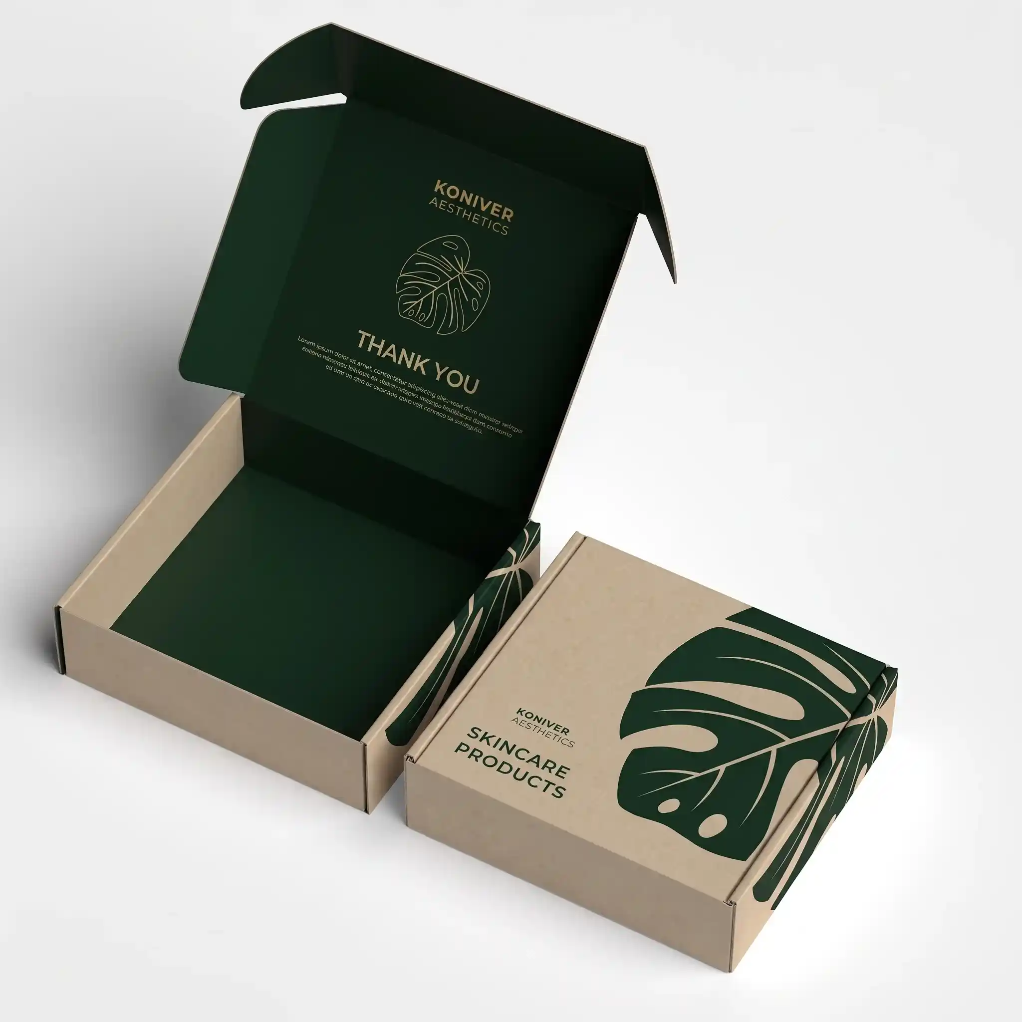
Color is processed by the brain faster than text, which means your color palette is doing marketing work before a customer reads a single word on the box. Stick to two or three primary colors maximum for the exterior of your packaging; busier palettes tend to read as cluttered or inexpensive, even when the underlying print quality is excellent. High-contrast combinations, such as a dark background with a metallic foil logo, create a premium effect at a glance, while soft, muted palettes on kraft or uncoated stock signal a natural or artisanal positioning. It's worth testing your color choices against competitor packaging in the same category so your box doesn't accidentally blend in with the shelf or the inbox of visually similar Instagram ads your customer has already scrolled past.
Typography Rules for Small-Format Packaging
Packaging is one of the least forgiving formats for typography because most panels are small and viewed briefly, often on a phone screen in a product photo before they're ever seen in person. Limit yourself to two typefaces: one for your logo or headline, and one simple, highly legible font for body copy such as ingredients or usage instructions. Avoid thin, decorative fonts for anything that needs to be read at a glance, including your brand name, since foil stamping and embossing can distort delicate letterforms during production. It also helps to leave generous white space around your logo rather than crowding it against other panel elements; a logo with breathing room reads as more premium than one squeezed between packaging copy and a barcode.
Use Finishes to Signal Value
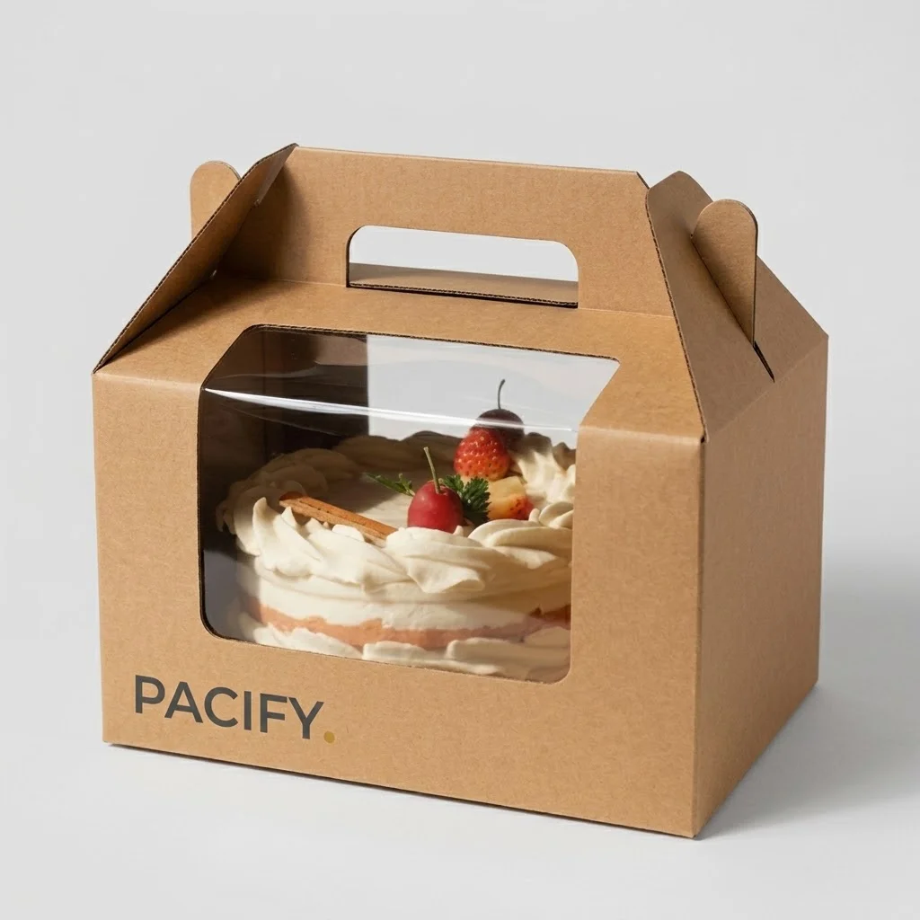
Finishing techniques are one of the most cost-effective ways to elevate a design without redesigning the artwork itself. Soft-touch lamination gives a box a velvety texture that customers notice the instant they pick it up, while gloss lamination creates a brighter, more reflective surface suited to bold, colorful designs. Foil stamping adds a metallic accent, ideal for logos or small details you want to catch the light, and spot UV creates a glossy raised texture over a matte background for subtle emphasis on specific design elements. Embossing and debossing add a tactile, three-dimensional quality that photographs beautifully for social media unboxing content. The key is restraint: pick one or two finishing techniques that reinforce your emotional target rather than layering every available option onto a single box.
Design for the Shelf, the Screen and the Doorstep
Modern packaging has to perform in at least three different contexts, and a design that only considers one of them will underperform in the others. On a retail shelf, your box needs to stand out from a distance and communicate its category instantly. In a product photo or unboxing video, the box needs strong contrast and clean lines that read well even when compressed by social media platforms. On a customer's doorstep, the box needs to survive shipping intact and look intentional even if it arrives slightly worn from transit. Before finalizing a design, mock it up in all three contexts: place it next to competitor products, photograph it under normal lighting, and if possible, ship a sample to yourself to see how it holds up. It's easy to over-index on how a design looks in a polished studio render and forget that most customers will first encounter it as a small thumbnail image or a box sitting on a porch in daylight. Designs with fine detail or subtle color contrast often lose impact in these real-world conditions, so testing under ordinary, imperfect circumstances is more useful than judging a design purely from a high-resolution mockup.
Don't Forget the Inside of the Box
Some of the most shared unboxing moments happen inside the box, not on the exterior, yet many brands spend their entire design budget on the outer print and leave the interior blank. A printed interior lid, a branded tissue paper wrap, or a custom insert with a personal thank-you message all extend the design story past the moment the lid comes off. These details cost relatively little to add during production but create a disproportionate amount of goodwill and social sharing, especially for gift-oriented or subscription products. If budget is tight, even a single branded element inside, such as a stamped thank-you card or a colored tissue paper that matches your palette, can make a noticeable difference in how premium the full experience feels.
Test Before You Print: Prototypes and Proofs
No matter how confident you are in a design on screen, colors, proportions, and finishes always look slightly different in physical form, especially once foil, embossing, or specific board weights are involved. Always request a physical sample or pre-production proof before committing to a full print run, and check it under different lighting conditions, since foil and metallic finishes can shift dramatically between daylight and indoor lighting. It's also worth testing your box with the actual product inside to confirm fit, since a design that looks perfect flat can reveal awkward proportions once assembled. It also pays to get a second opinion before finalizing a design. Show your proof to a handful of people outside your immediate team, ideally people who match your target customer, and ask what they notice first and what they think the product costs based on the packaging alone. Reactions from people who haven't spent weeks staring at the design file are often more revealing than internal feedback, and they can catch confusing layouts or unclear branding before you commit to a full production run. At Pacify Packaging, our team walks every client through digital proofs and physical samples before full production, so you can catch design issues early. If you're ready to bring a packaging concept to life, request a quote and we'll help you turn your design into a manufactured box.
Ready for custom packaging?
Get a free design consult and a quote within 24 business hours from Pacify Packaging.
Request a Free Quote →